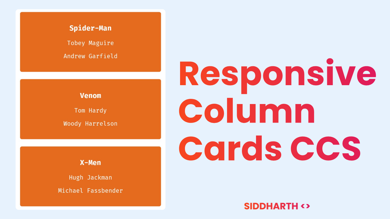
Today, we are going to create a tutorial on how to create Responsive Column Cards using CSS only. Column cards are a great way to display content in a visually appealing manner, and with our tutorial, you'll learn how to make them responsive, so they look great on all devices. We'll cover everything from creating the HTML structure to styling the cards using CSS.
This is your HTML for Responsive Colums:
<div class="container-of-columns">
  <div class="column">
    <div class="card">
      <h3>Spider-Man</h3>
      <p>Tobey Maguire</p>
      <p>Andrew Garfield</p>
    </div>
  </div>

  <div class="column">
    <div class="card">
      <h3>Venom</h3>
      <p>Tom Hardy</p>
      <p>Woody Harrelson</p>
    </div>
  </div>

  <div class="column">
    <div class="card">
      <h3>X-Men</h3>
      <p>Hugh Jackman</p>
      <p>Michael Fassbender</p>
    </div>
  </div>
</div>
This is nothing without CSS. Here is your CSS Code:
* {
  box-sizing: border-box;
}
.column {
  float: left;
  width: 33%;
  padding: 0 10px;
}
.container-of-columns {
  margin: 0 -5px;
}
.container-of-columns:after {
  content: "";
  display: table;
  clear: both;
}
.card {
  padding: 16px;
  text-align: center;
  background-color: #e56b1f;
  border-radius: 5px;
  color: #ffffff;
}
@media screen and (max-width: 600px) {
  .column {
    width: 100%;
    display: block;
    margin-bottom: 20px;
  }
}
If you want to add Shadow to Cards to look them more real, Following changes are needed in .card class:
.card {
  padding: 16px;
  text-align: center;
  background-color: #e56b1f;
  border-radius: 5px;
  color: #ffffff;
  box-shadow: 0.8px 1.6px 1.6px hsl(0deg 0% 0% / 0.48);
}
You have successfully learned creating Responsive Column Cards using CSS. If you have any doubt. Leave the comments below. Thank you!


Comments
Post a Comment